Premium SaaS admin template — 85+ pages, 30+ chart variants, AI suite, CRM pipeline, billing, HR, developer center. Built with Vite 8, vanilla JavaScript, and SCSS. No Bootstrap, no jQuery, no SPA framework.


Aurora is a 2026-grade commercial SaaS admin template built on a modern, framework-free stack. Every screen is hand-crafted with its own visual identity — no two dashboards look the same, no two tables share the same chrome, and every component ships with the polish you'd expect from a marketplace best-seller.
The template ships with 85 production-ready pages spanning operations, analytics, sales, system health, AI suite, CRM, billing, projects, marketing, warehouse, HR, developer center, and full authentication + error flows.
- Stack you already know. Vite 8 + Vanilla ES2022 + SCSS. No React, no Tailwind, no build-step surprises.
- Tiny footprint. 75KB main bundle (20KB gzipped). Heavyweight vendors (ECharts, DataTables, Leaflet) are lazy-loaded per page.
- Premium design system. 11-stop color scale × 9 hues, 12-step spacing, 8-step radius, 6-step elevation, motion tokens, dark mode.
- 85 hand-crafted pages. Each with its own layout, charts, and component arrangement.
- Production features. Command palette (⌘K), theme toggle with no FOUC, PWA-ready, accessibility-first, SEO-optimized.
- Fixed sidebar with 12 nav groups, collapsible submenus, active state with glow
- Sticky glassmorphic topbar with global search-as-command-palette
- Smart breadcrumbs derived from
data-breadcrumbattribute - Notifications + messages dropdowns with unread indicators
- User menu with profile/settings/lock/sign-out
- Brand-pin sidebar collapse (desktop) + off-canvas drawer (mobile)
- Pre-paint theme script (no dark-mode flash)
- Mobile-responsive at 1280/1024/900/768/480 breakpoints
- 9-hue color palette (primary, secondary, accent, success, warning, danger, info) — each with 50–950 stops
- 11-stop neutral scale with cool blue tint
- Full light + dark mode via CSS custom properties
- WCAG AA contrast on every text/background pair
- Typography: Inter (body) + Sora (display) + JetBrains Mono (code)
- 12-step spacing scale (4px base, matches Tailwind mental model)
- 8-step radius scale (4–24px + full)
- 6-step shadow/elevation system
- Motion tokens (4 easings × 6 durations)
- Buttons (7 variants × 4 sizes + icon/pill/block)
- Cards (default, hero, stripe, elevated, flat, glass) with hover states
- Stat cards + KPI hero tiles
- Tables (sticky headers, hover actions, compact, striped, borderless variants)
- Forms (floating labels, validation, input groups, chip-inputs, segmented controls, password strength, range sliders)
- Badges + status dots
- Progress bars + circular rings
- Toggles + switches
- Tabs (underline + pill variants)
- Alerts + callouts
- Avatars + avatar stacks
- Timeline + activity feed
- Skeletons with shimmer
- Dropdowns / menus / popovers
- CSS-driven tooltips
- Empty states
- Heatmaps + contribution grids
- 19 chart types: line, area, stacked area, bar, horizontal bar, mixed bar+line, pie/donut, radar, gauge, scatter, heatmap, funnel, candlestick, treemap, sankey, calendar heatmap, gantt, polar bar
- All charts read CSS custom properties → automatic dark-mode redraw
- Skeleton placeholders during load
- Window resize + theme change listeners
| Category | Pages |
|---|---|
| Dashboards | Operations, Analytics, Sales, System health |
| AI suite | AI dashboard, AI chat, AI assistant, AI analytics, Prompt library, Knowledge base |
| CRM | CRM overview, Lead details, Deal pipeline (kanban), Customer timeline |
| Sales & billing | Subscriptions, Billing, Invoices, Expenses, Payroll |
| Projects | Projects, Project detail, Calendar, Timeline |
| Communication | Chat, Inbox, Notifications, Help center |
| Marketing | Email campaigns, SEO dashboard, Media library |
| Warehouse | Storefront, Product, Orders, Order detail, Inventory, Assets |
| HR | Employees, Recruitment, Attendance, Contacts, User management |
| Developer center | API keys, Webhooks, Audit logs, Roles, Security center, Activity log |
| Content | Forms (6), Tables (2), Charts (3), UI elements, Widgets, Playground, Theme studio, Typography, Icons, Maps, File manager |
| Account | Profile, Settings, Pricing, Docs, Release notes |
| Layouts & errors | Fixed sidebar/footer, Nested page, Blank, Marketing landing, Maintenance, Coming soon, 403, 404, 500, Offline |
| Auth | Login, Register, Forgot password, 2FA, Lock screen |
- Command palette (⌘K / Ctrl+K) with fuzzy search across pages + actions
- Count-up number animations on viewport entry
- Reveal-on-scroll with staggered delays
- Skeleton shimmer during async loads
- Toast notifications
- Modal dialogs
- Slide-out drawers
- Hover actions on table rows
Aurora is a premium admin template. If you want more specialized dashboard systems in the MTVerse ecosystem, explore these premium MTVerse dashboard templates.
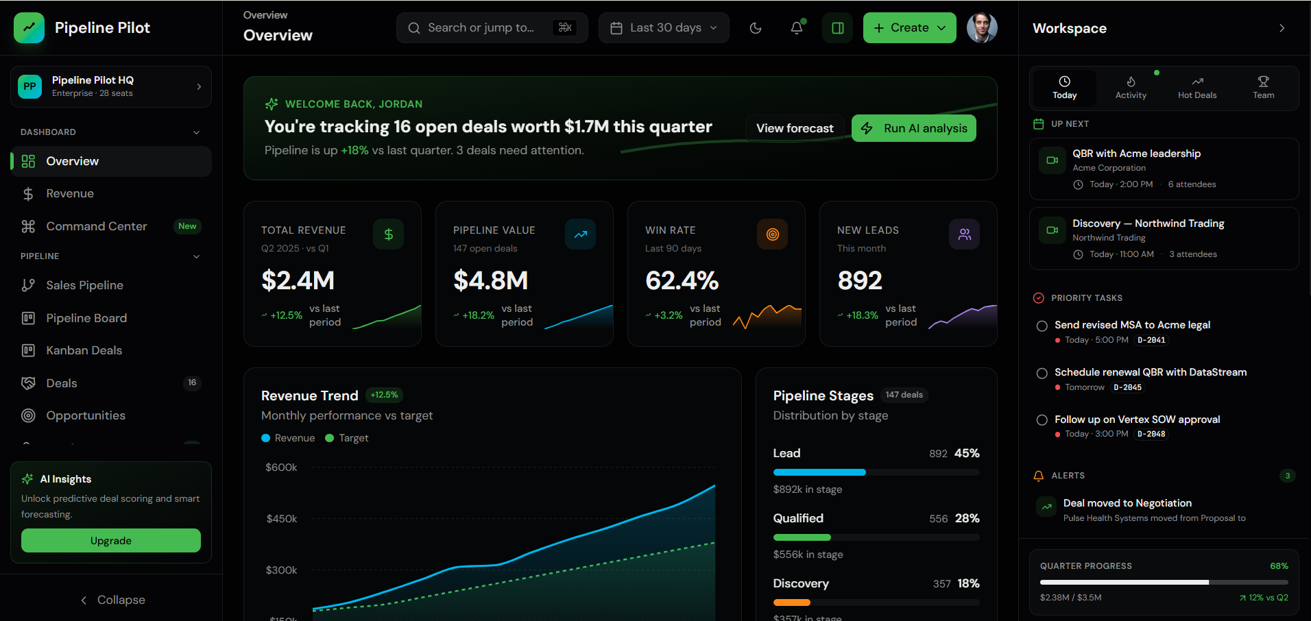
Pipeline Pilot Premium sales operations dashboard for CRM pipelines, revenue forecasting, team performance, and deal management. |
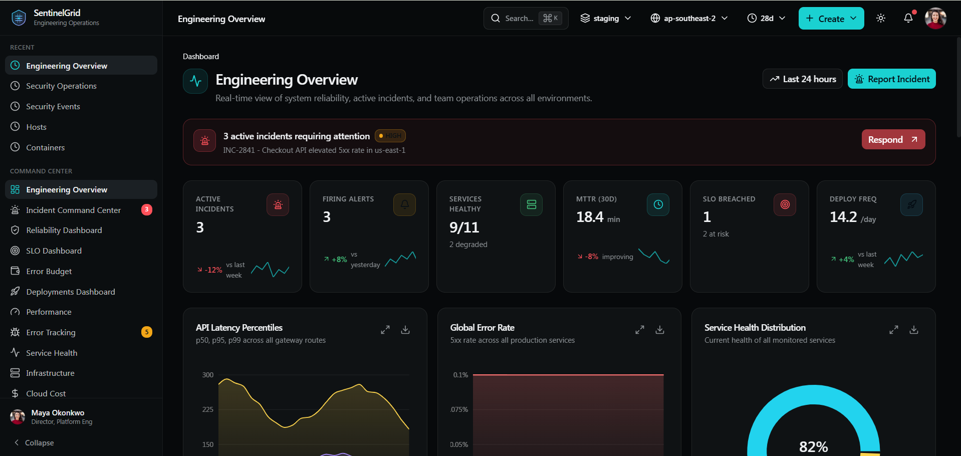
SentinelGrid SRE observability dashboard for incidents, platform health, services, deployments, and DevOps command centers. |
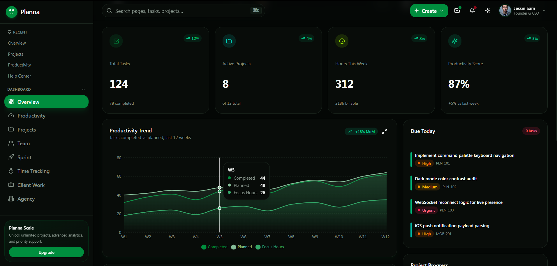
Planna Dashboard Project management dashboard for tasks, team planning, delivery timelines, client workspaces, and productivity flows. |
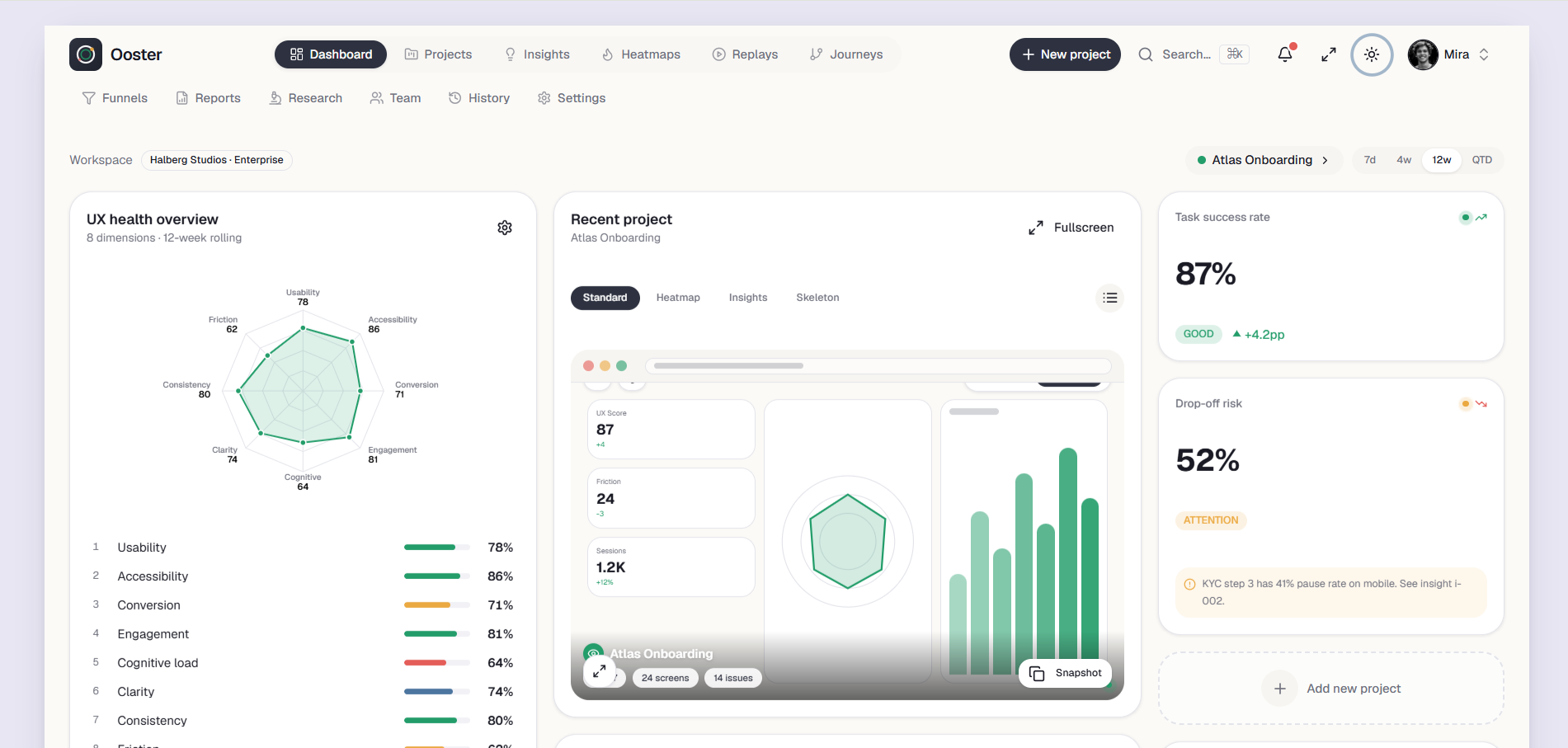
Ooster UX research and product analytics dashboard for heatmaps, usability tests, experiments, insights, and CRO teams. |
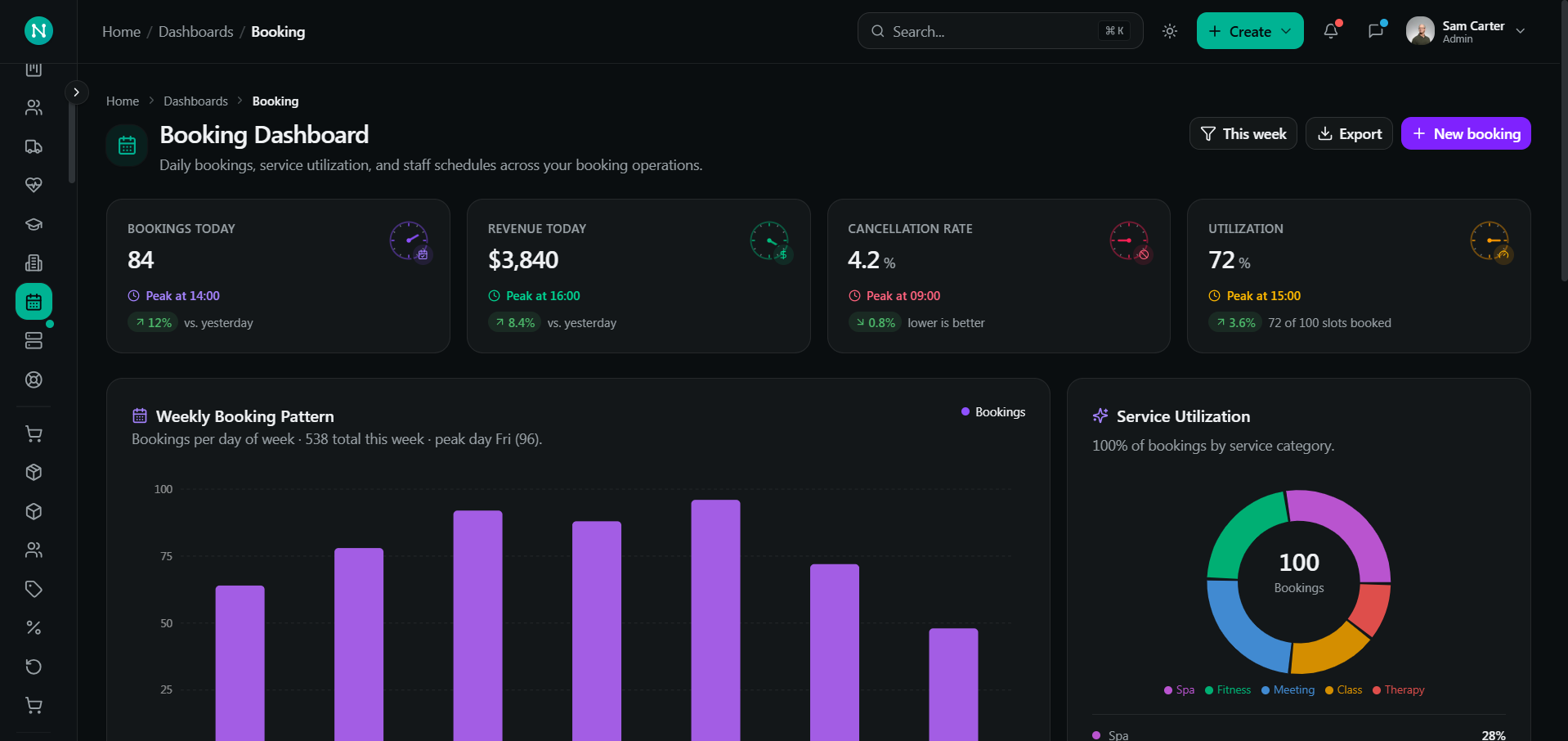
NexusGrid Premium Next.js admin UI kit for SaaS, ecommerce, CRM, analytics, charts, tables, and product admin systems. |
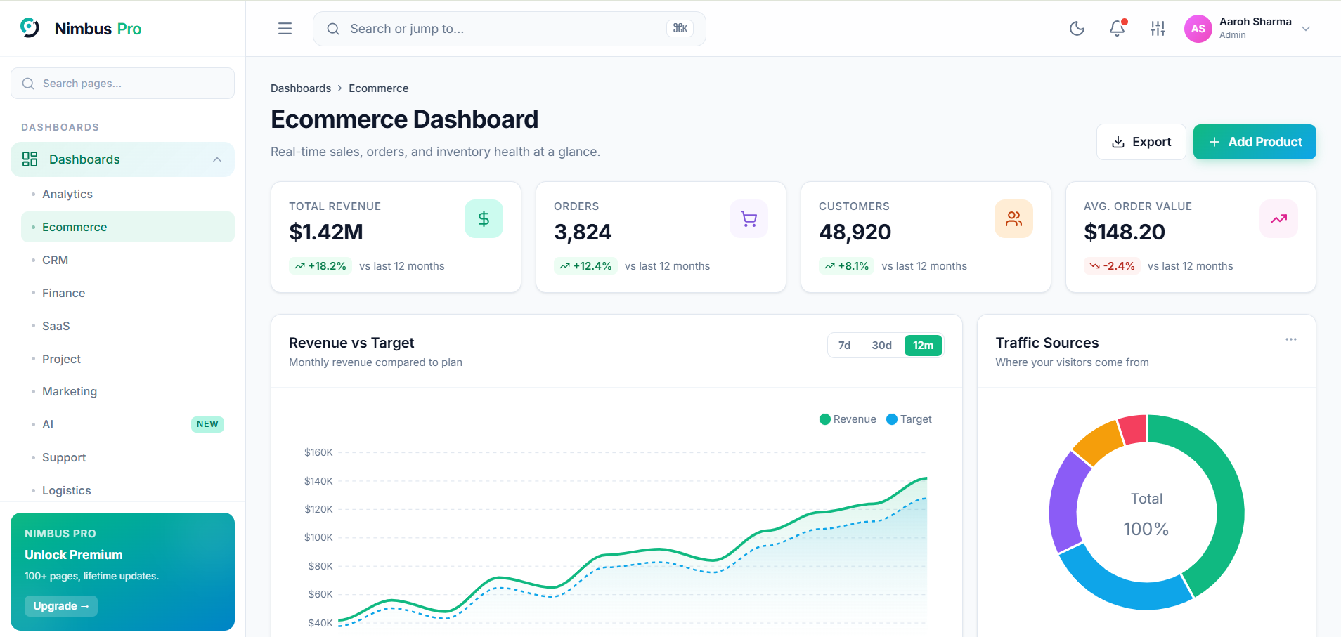
Nimbus Pro Premium SaaS admin dashboard UI kit with ecommerce analytics, dark mode, charts, command palette, and app pages. |
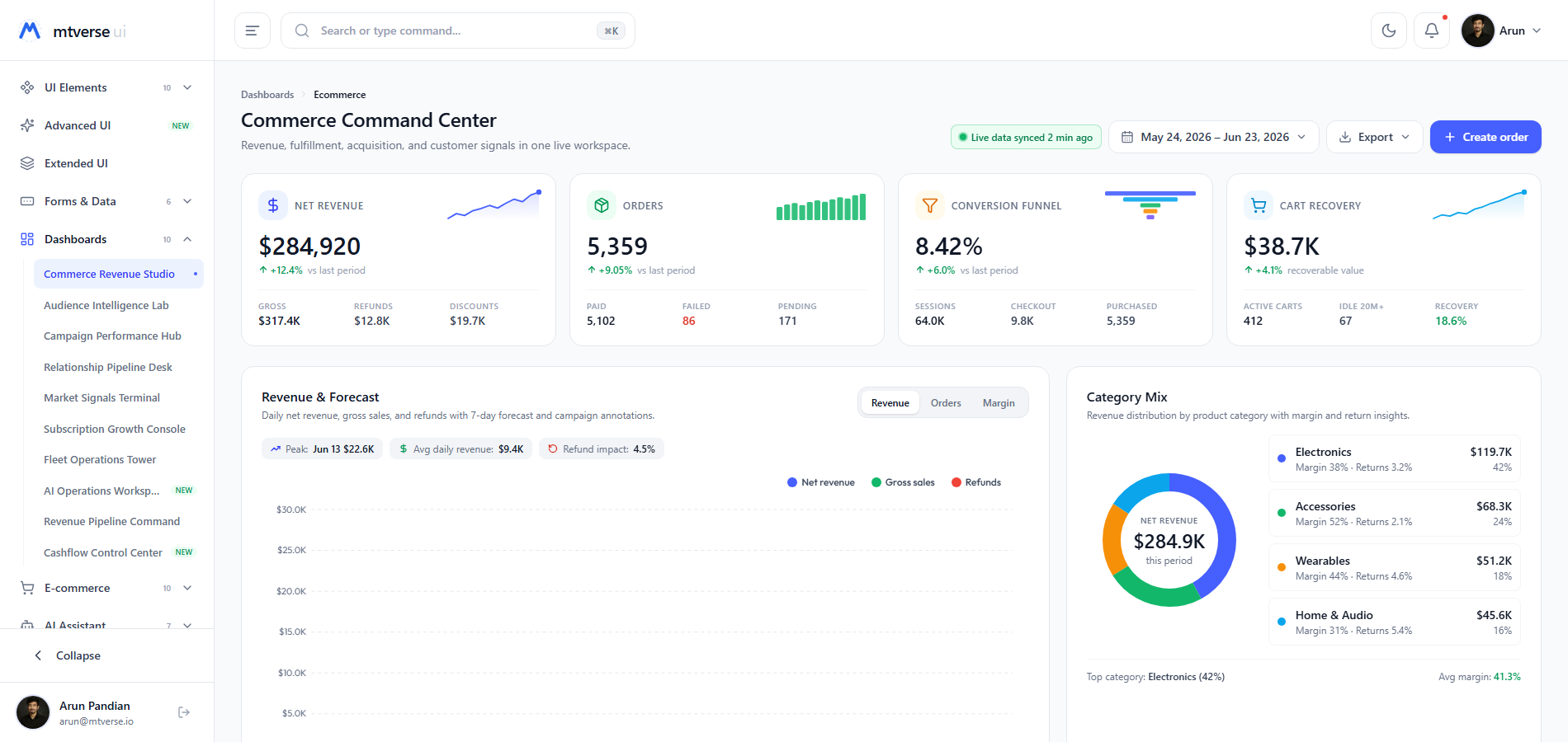
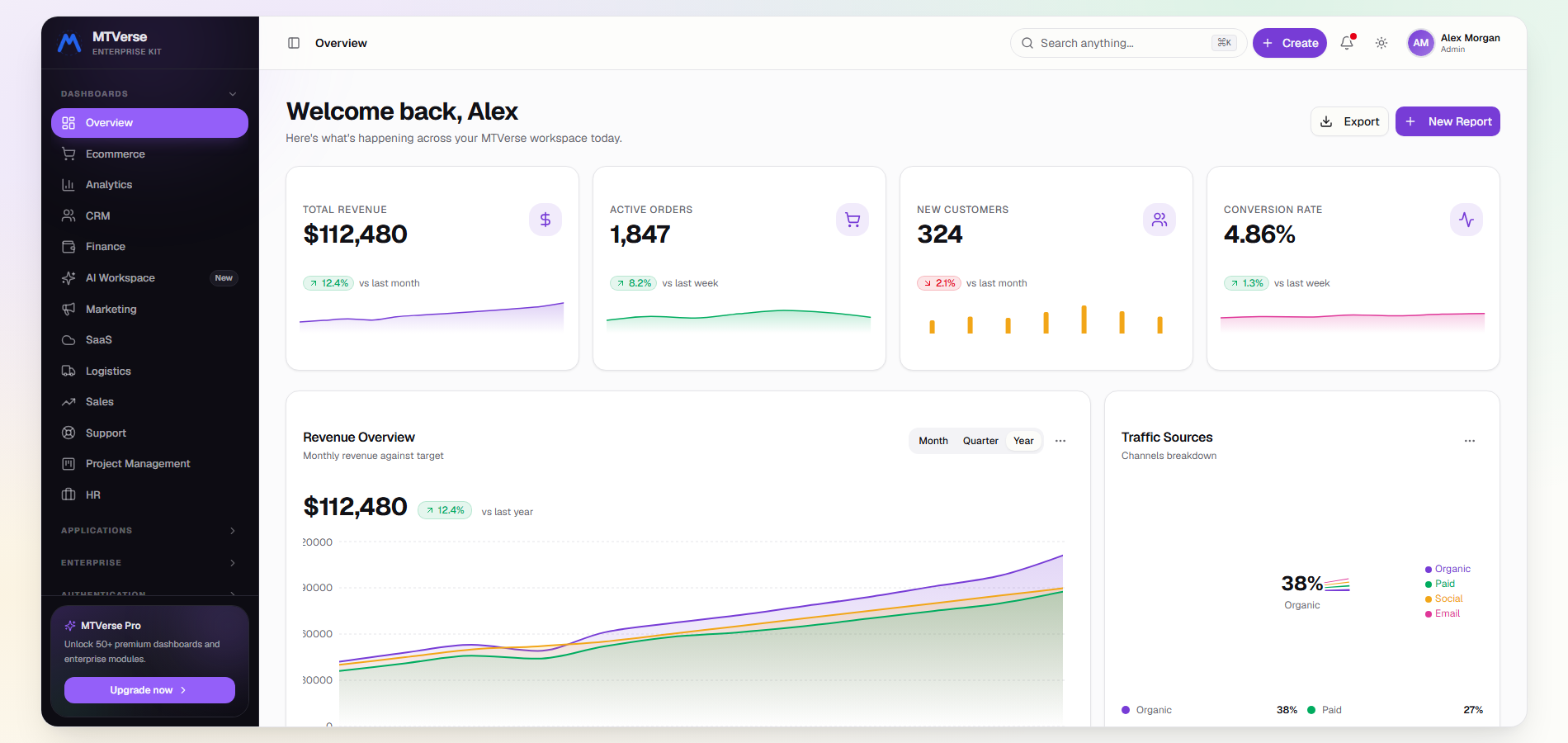
MTVerse Modular AI SaaS dashboard template with modular analytics, ecommerce metrics, CRM views, and modern Next.js UI patterns. |
MT Box Enterprise Enterprise SaaS admin dashboard for RBAC, audit logs, billing, team operations, and business management workflows. |
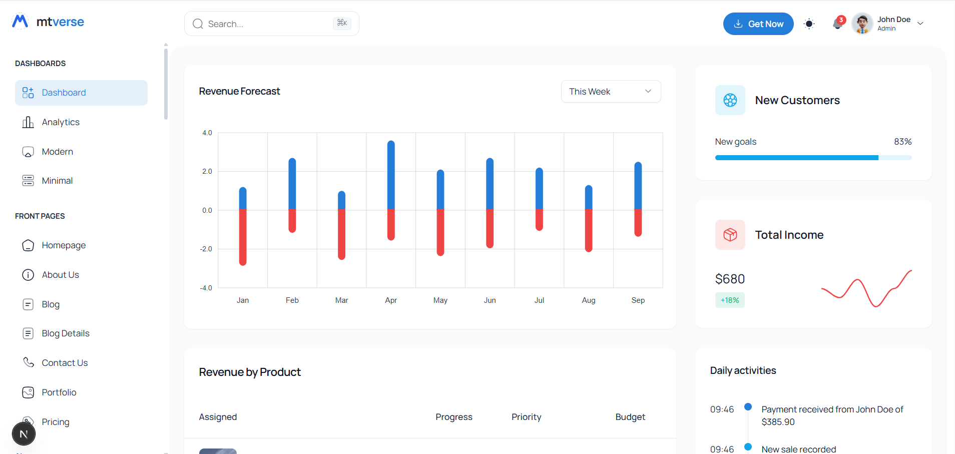
Mat Dash Next.js admin dashboard template for ecommerce admin, invoices, tables, analytics cards, and operational dashboards. |
|
# Clone
git clone https://github.com/aurora-labs/aurora-admin.git
cd aurora-admin

# Install
npm install

# Dev server (port 9173 → opens /production/index.html)
npm run dev

# Production build → dist/
npm run build

# Preview built site (port 9174)
npm run preview- Node 20+ (check
.nvmrc) - Modern browser (Chrome 100+, Firefox 100+, Safari 15+, Edge 100+)
aurora-admin/
├── production/                # 85 HTML entry pages (auto-discovered by Vite)
├── public/                    # Copied verbatim to dist/ (favicon, sw.js, manifest, images)
├── src/
│   ├── main.js                # Entry — mounts shell, lazy-loads page modules
│   ├── scss/
│   │   └── v4/
│   │       ├── main.scss      # @use's the partials below
│   │       ├── _tokens.scss   # Design tokens (colors, type, spacing, radius, shadows, motion)
│   │       ├── _layout.scss   # Shell: sidebar, topbar, grid, footer, responsive
│   │       ├── _components.scss # Buttons, cards, tables, badges, progress, etc.
│   │       ├── _forms.scss    # Inputs, validation, floating labels, upload zones
│   │       ├── _widgets.scss  # Activity feed, todo, donut, leaderboard, heatmap
│   │       ├── _datatable.scss# DataTables.net re-skin
│   │       ├── _apps.scss     # Inbox, kanban, chat, calendar, settings
│   │       ├── _auth.scss     # Login, register, forgot, 2FA, lock, errors
│   │       └── _pages.scss    # Per-page styles (kept narrow)
│   └── v4/
│       ├── shell.js           # mountShell — sidebar/topbar wiring
│       ├── shell-render.js    # Pure renderers + NAV + ICONS
│       ├── menus.js           # openMenu / openPanel
│       ├── modal.js           # showModal
│       ├── toast.js           # showToast
│       ├── charts.js          # ECharts factory + initCharts()
│       ├── tables.js          # DataTables initialiser
│       ├── command-palette.js # ⌘K
│       ├── page-actions.js    # Count-up, reveal-on-scroll, button handlers
│       ├── inbox.js kanban.js calendar.js settings.js file-manager.js
│       ├── form-controls.js   # Date range, multi-select, rich text
│       └── details.js markup.js data-adapter.js
├── types/aurora.d.ts          # Type declarations
├── vite.config.js             # Vite + shell injection plugin + chunking
├── package.json
└── README.md
Aurora uses Vite 8 (Rolldown bundler) with three custom optimizations:
- Auto-discovered entries.
discoverEntries()walksproduction/*.htmland registers each as a Rollup input. Drop a file in, run dev — it's live. - Build-time shell injection. The
shellInjectionPlugininlines sidebar/topbar/footer into every page withdata-shell="admin". No FOUC, no client-side render cost. - Lazy vendor chunks. Only three vendor chunks are emitted, all loaded on demand:
vendor-echarts— chart pages onlyvendor-tables— table pages onlyvendor-maps— map page only
dist/
├── index.html              # � production/index.html, shell injected
├── ai_dashboard.html
├── ... 85 HTML files
├── js/
│   ├── main-[hash].js      # 75 KB → 20 KB gzipped
│   ├── vendor-echarts-[hash].js  # lazy
│   ├── vendor-tables-[hash].js   # lazy
│   └── vendor-maps-[hash].js     # lazy
├── css/
└── assets/
BASE_PATH=/admin/ npm run buildAll theming happens via CSS custom properties in src/scss/v4/_tokens.scss. Two scopes:
:root— light mode defaults[data-theme="dark"]— dark mode overrides
The pre-paint inline script (injected by the Vite plugin) sets data-theme on <html> from localStorage('theme') (or prefers-color-scheme) before the body renders.
// Toggle theme at runtime
document.documentElement.setAttribute('data-theme', 'dark');
localStorage.setItem('theme', 'dark');// Colors
--primary: var(--color-primary-500); // #6366f1 indigo
--accent: var(--color-accent-500); // #06b6d4 cyan
--secondary: var(--color-secondary-500);// #8b5cf6 violet
--success / --warning / --danger / --info
// Surfaces
--bg-app / --bg-surface / --bg-surface-2 / --bg-surface-3 / --bg-elevated
// Text
--text-strong / --text / --text-secondary / --text-muted / --text-disabled
// Borders
--border / --border-strong / --border-subtle / --border-focus
// Spacing (4px base)
--space-1 (4px) ... --space-12 (96px)
// Radius
--radius-sm (6px) / --radius (10px) / --radius-lg (16px) / --radius-xl (20px)
// Shadows
--shadow-xs / --shadow-sm / --shadow / --shadow-md / --shadow-lg / --shadow-xl
// Motion
--ease-standard / --ease-emphasized / --ease-out / --ease-in
--dur-fast (120ms) / --dur-base (180ms) / --dur-slow (240ms)npm run new -- my-page --title "My Page" --nav-group "Admin"Or by hand:
- Create
production/my-page.html:<body data-shell="admin" data-page="my-page" data-breadcrumb="Home > My Page"> <main class="main"><div class="page-wrapper"> <!-- content --> </div></main> <script type="module" src="/src/main.js"></script>
- Append to the right group in
NAV(insrc/v4/shell-render.js).keymatchesdata-page.
<div class="chart" data-chart="my-chart"></div>in the page.- Register a factory in
src/v4/charts.js:function myChart(ec, el, t) { const chart = ec.init(el); chart.setOption({ /* ECharts option */ }); return chart; } const charts = { ..., 'my-chart': myChart };
- Read colors via
getComputedStyle(document.documentElement).getPropertyValue('--token-name')— dark mode redraw is automatic.
Aurora ships 50+ reusable component classes. Here are the most-used:
<button class="btn btn-primary">Primary</button>
<button class="btn btn-secondary">Secondary</button>
<button class="btn btn-ghost">Ghost</button>
<button class="btn btn-outline">Outline</button>
<button class="btn btn-danger">Danger</button>
<button class="btn btn-sm btn-icon"><svg>...</svg></button><div class="card">
<div class="card-header">
<div>
<div class="card-title">Title</div>
<div class="card-subtitle">Subtitle</div>
</div>
<div class="card-actions">...</div>
</div>
<div class="card-body">...</div>
</div>
<!-- Variants -->
<div class="card card-stripe is-success">...</div>
<div class="card card-hero">...</div>
<div class="card card-elevated">...</div><div class="card">
<div class="stat">
<div class="stat-icon teal"><svg>...</svg></div>
<div class="stat-content">
<div class="stat-label">Total users</div>
<div class="stat-value-row">
<span class="stat-value" data-count-up="24891">0</span>
<span class="stat-change up">+8.2%</span>
</div>
<div class="stat-subtext">342 new this week</div>
</div>
</div>
</div><div class="table-wrap">
<table class="table table-actions-on">
<thead><tr><th>Col</th></tr></thead>
<tbody>
<tr>
<td class="cell-strong">Value</td>
<td class="cell-actions">
<button class="btn-icon btn-sm btn-ghost">...</button>
</td>
</tr>
</tbody>
</table>
</div><div class="form-group">
<label class="form-label">Email <span class="required">*</span></label>
<input type="email" class="form-control" placeholder="you@company.com">
<div class="form-help">We'll never share your email.</div>
</div>
<!-- Floating label -->
<div class="form-floating">
<input type="text" class="form-control" id="name" placeholder=" ">
<label for="name">Full name</label>
</div>See production/docs.html for the in-app documentation hub covering every component, layout, and JavaScript API.
Three layout modes available via body classes:
- Default — fixed sidebar + sticky topbar + scrolling content (most pages)
- Sidebar collapsed —
body.sidebar-collapsed— 76px rail sidebar with icon-only nav (toggled via brand-pin) - Mobile drawer — automatic at <900px — sidebar slides in as overlay
Special layouts:
- Auth pages — no shell (login, register, forgot, 2FA, lock, errors)
- Marketing landing — public-facing, no shell
- Blank canvas —
data-shellomitted, just the page wrapper
src/main.js — single bundle for every page. Imports scss/v4/main.scss, mounts the shell, registers ECharts/DataTables/Leaflet placeholders, then lazy-imports page-specific modules guarded by DOM presence:
mountShell();
initCharts();
initTables();
initCommandPalette();
initPageActions();

// Lazy-load per-page
if (document.getElementById('inbox-root')) {
  import('./v4/inbox.js').then((m) => m.initInbox());
}| Module | Exports |
|---|---|
shell.js |
mountShell() |
shell-render.js |
NAV, ICONS, BRAND_MARK, renderShell() |
menus.js |
openMenu(), openPanel(), DEFAULT_CARD_MENU |
modal.js |
showModal({ title, body, actions }) |
toast.js |
showToast(message, { variant }) |
charts.js |
initCharts() |
tables.js |
initTables() |
command-palette.js |
initCommandPalette(), openCommandPalette() |
page-actions.js |
initPageActions() (count-up + reveal + button handlers) |
- Vanilla DOM only.
querySelector,classList,addEventListener. No jQuery. - Lazy import per-page modules with DOM-presence guards so the main bundle never ships unused code.
- Idempotent
init<Name>()exports. Safe to call when the root element is absent; safe to call twice. - Event delegation on
documentfor common interactions. - CSS custom properties for colors. Never hex literals in components.
npm run build
# Upload dist/ to any static host:
#   - Vercel
#   - Netlify
#   - Cloudflare Pages
#   - AWS S3 + CloudFront
# - GitHub PagesBASE_PATH=/admin/ npm run buildRecommended Cache-Control headers:
# HTML — short cache
/*.html                public, max-age=300, must-revalidate

# Hashed assets — long cache
/js/*.js               public, max-age=31536000, immutable
/css/*.css             public, max-age=31536000, immutable

# Images — medium cache
/images/*              public, max-age=86400
- Main bundle: 75 KB (20 KB gzipped)
- Largest lazy chunk: vendor-echarts at 1.07 MB (354 KB gzipped) — only loaded on chart pages
- No render-blocking CSS — critical SCSS compiled to a single stylesheet loaded in
<head> - Font loading:
font-display: swapon all Google Fonts; preconnect tofonts.googleapis.comandfonts.gstatic.com - Image lazy-loading: native
loading="lazy"on<img>tags - Code-splitting: per-page chunks auto-generated by Vite
- Tree-shaking: Terser with
pure_getters,unused,dead_code,collapse_vars - PWA: service worker registered in production only; precaches the app shell
- Unique
<title>and<meta name="description">on every page (auto-derived from breadcrumb via the Vite plugin if not specified) - Open Graph + Twitter Card meta tags injected by the Vite plugin
- Semantic HTML5 (
<main>,<header>,<nav>,<aside>,<article>,<section>) robots.txtandsitemap.xmlinpublic/aria-current="page"on active nav links and breadcrumbaria-label,aria-expanded,aria-haspopupon interactive elements- Skip-link to
#main-contentfor keyboard users
- WCAG AA color contrast on every text/background pair (4.5:1 minimum)
- Keyboard navigation — full tab order, visible focus rings, Escape to close overlays
- Screen reader support — semantic landmarks, ARIA labels,
aria-hiddenon decorative icons - Reduced motion —
@media (prefers-reduced-motion: reduce)disables animations - Skip link —
Skip to main contentlink appears on first Tab - Focus management — modal/drawer focus trap; focus returns to trigger on close
| Browser | Version |
|---|---|
| Chrome | 100+ |
| Firefox | 100+ |
| Safari | 15+ |
| Edge | 100+ |
| iOS Safari | 15+ |
| Android Chrome | 100+ |
Aurora uses CSS color-mix(), backdrop-filter, aspect-ratio, CSS custom properties, and IntersectionObserver — all broadly supported in 2024+ browsers.
Can I use this in a commercial product? Yes — Aurora is MIT licensed. Use it in unlimited commercial projects.
Can I remove the "Aurora" branding?
Yes — replace the brand mark in src/v4/shell-render.js (BRAND_MARK constant) and the brand name in renderSidebar().
Does it work without JavaScript? The shell and core layout render server-side (build-time injection), so basic navigation works without JS. Charts, tables, command palette, and interactive components require JS.
Can I add my own chart types?
Yes — see "Adding a chart" above. Register a factory function in src/v4/charts.js and reference it via data-chart="your-id".
How do I customize the color palette?
Edit :root and [data-theme="dark"] blocks in src/scss/v4/_tokens.scss. All components read semantic tokens, so changing --primary cascades everywhere.
Does it support RTL?
Not out of the box. SCSS uses logical properties in some places but full RTL would require a dir="rtl" audit pass.
Build fails with "Cannot find module 'sass'"
Run npm install — Sass is a dev dependency.
Charts not rendering in production
Check the browser console for CSP violations. ECharts is lazy-loaded; ensure your CSP allows script-src 'self' and that vendor chunks are served from the same origin.
Dark mode flashes on reload
The pre-paint theme script (injected by the Vite plugin) reads localStorage('theme') and sets data-theme before body render. If you're seeing a flash, you may have bypassed the Vite plugin (e.g. opening a raw HTML file). The runtime mountShell() fallback handles this for dev convenience.
Sidebar doesn't collapse on desktop
Click the brand-pin icon in the sidebar header. State persists in localStorage('aurora:sidebar-collapsed').
Fonts look wrong
Ensure your network can reach fonts.googleapis.com. For fully offline use, download Inter, Sora, and JetBrains Mono and host them locally.
- RTL support
- More chart types (sunburst, theme river, graph)
- Form builder playground
- Email template gallery
- Inline docs for every component
- Multi-tenant workspace switcher
See release_notes.html in the app, or changelog.md in the repo.
- Complete rebrand from Gentelella → Aurora
- New design system (Indigo primary, Sora display font, 8-step radius, 6-step shadows)
- New shell with brand-pin collapse, glassmorphic topbar, command palette trigger
- New component library (50+ components, all dark-mode aware)
- 27 new pages added (AI suite, CRM, billing, HR, marketing, dev center, docs)
- Total: 85 pages, 75KB main bundle, full WCAG AA contrast
- ECharts by Apache — chart rendering
- DataTables.net by SpryMedia — dynamic tables
- Leaflet by Vladimir Agafonkin — maps
- Inter by Rasmus Andersson — body typeface
- Sora by Jonathan Pasquier — display typeface
- JetBrains Mono by JetBrains — monospace
- Iconography — Lucide-inspired, custom inline SVG
MIT © Aurora Labs. See LICENSE.txt for details.